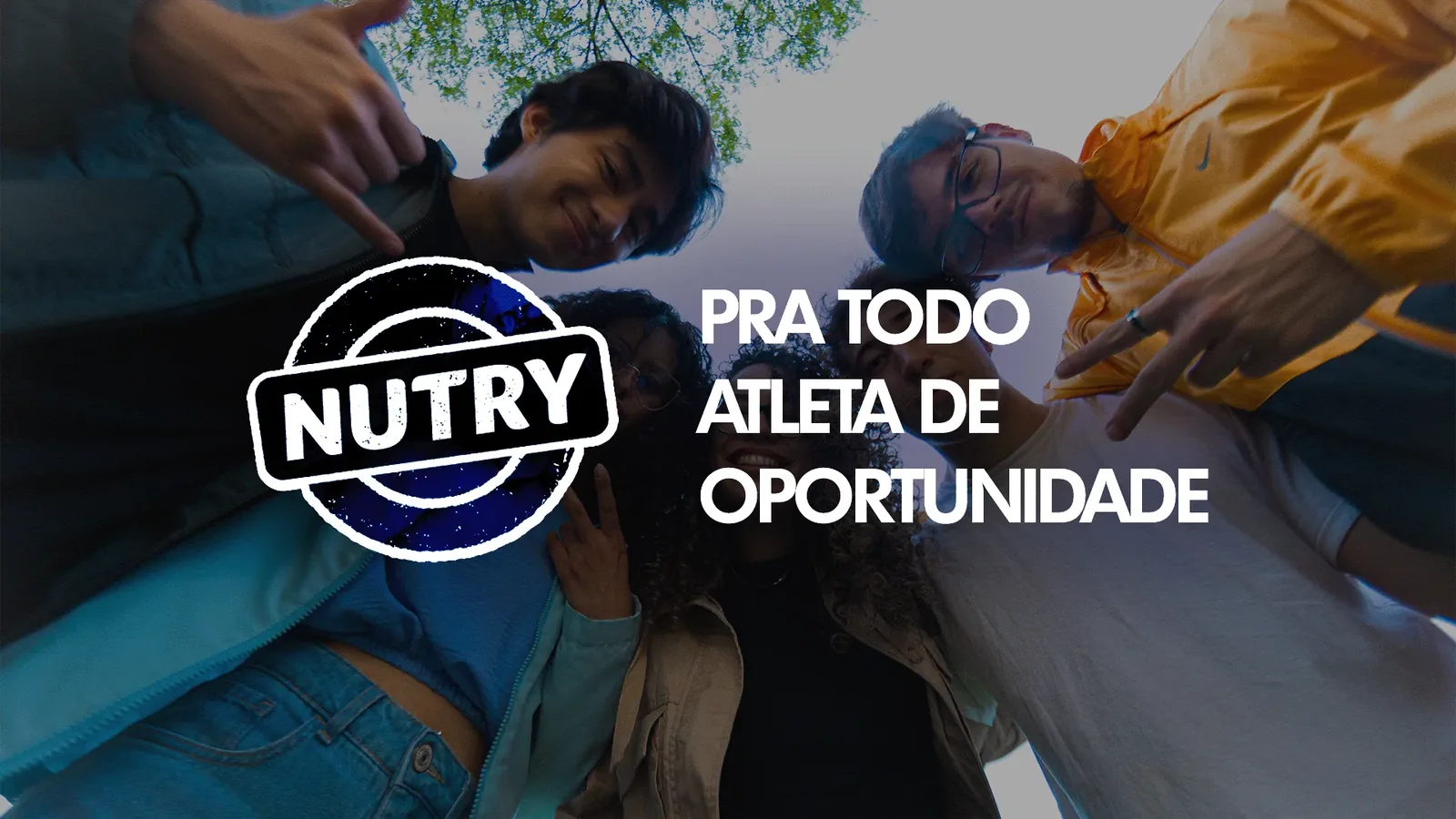
NUTRY
Advertising campaign
- Brand
- Nutry, protein bar line
- Year
- 2025
- Nature
- Final undergraduate project (TCC), done as a team
- My role
- Visual identity and graphic design
- Tools
- Illustrator, Photoshop
- Credits
- Concept, copy and planning: Maria Eduarda FerreiraArt direction and graphic design: Murilo Capelo and Laissa AlmeidaPlanning and media: Jaianny SantanaVideo editing: Felipe Cubas
Nutry is a well-established brand in the snack and convenient food segment, especially recognized for its cereal bar category. In this project, the challenge was to strengthen the protein bar line by expanding its perception beyond the sports universe and connecting the product to a contemporary lifestyle.
The campaign was built around the concept of the “Opportunity Athlete,” representing people who move between a busy routine and physical activity whenever the opportunity arises. The visual identity brings these two worlds together through a fun, youthful and modern aesthetic, built through dynamic visual elements, typography and color choices that translate movement and authenticity, values that reinforce the brand’s positioning within the real lives of its consumers.
Identity
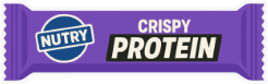
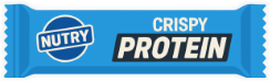
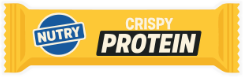
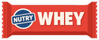
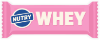
The identity borrows from the product and from the street. A deep navy and a strong blue anchor the brand, warm orange and sand bring the energy of everyday movement, and each bar keeps its own color so the line is recognized at a glance. Futura TS, in heavy, bold and demibold, gives the voice a direct, athletic tone. A set of small illustrations, from the bike to the chess pawn, says that an athlete can be anyone, in any activity.
Futura TS Heavy
Futura TS Bold
Futura TS Demibold












Campaign
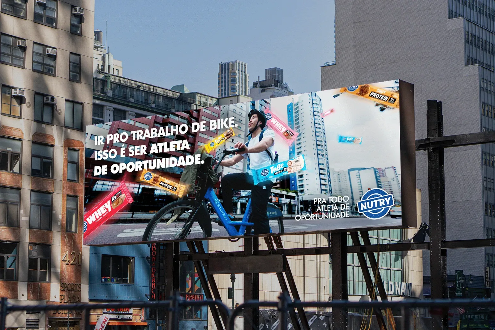
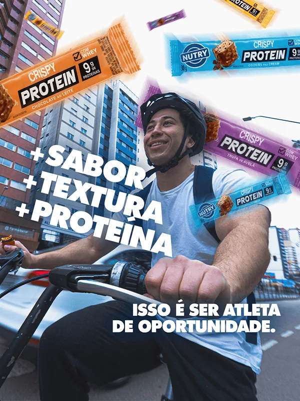
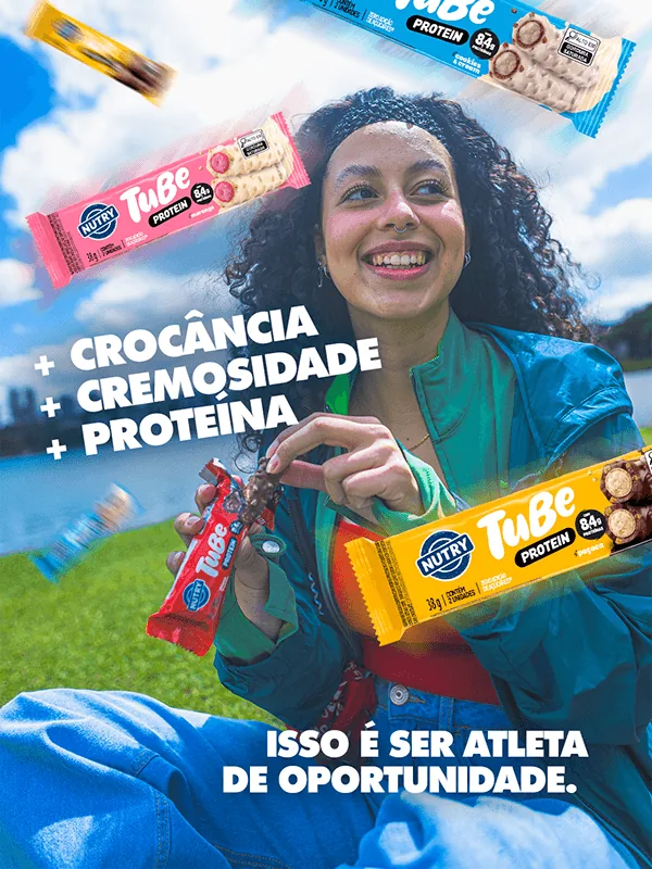
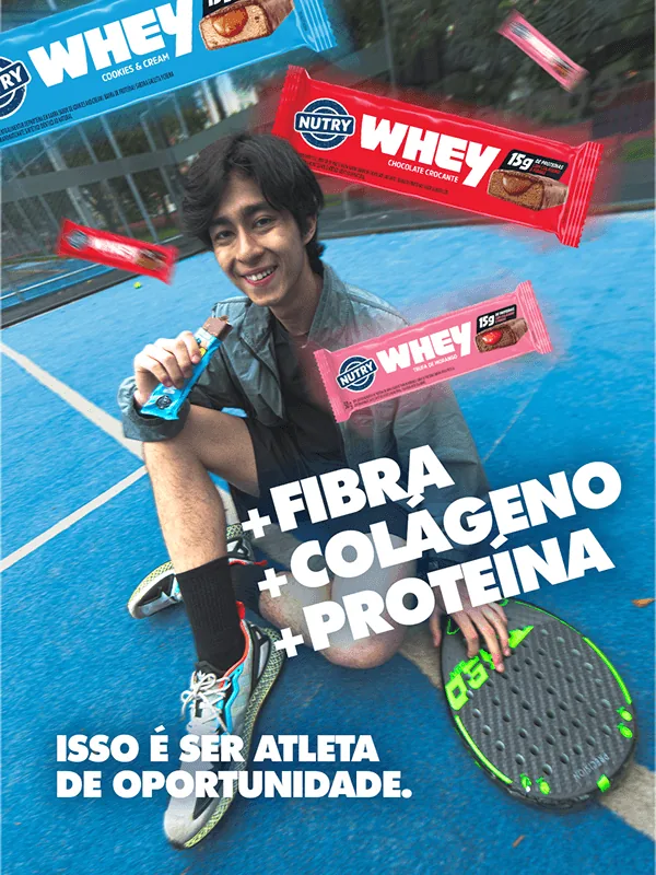
The campaign meets people in the middle of their routine: pedaling to work, skating in the park, playing on a court. Each line of bars gets its own message, built the same way: three benefits and one promise. “+ sabor, + textura, + proteína” for Crispy Protein, “+ crocância, + cremosidade, + proteína” for Tube, “+ fibra, + colágeno, + proteína” for Whey, always closing with “Isso é ser atleta de oportunidade.” The bars float around the people, like the energy they bring.
At the shelf
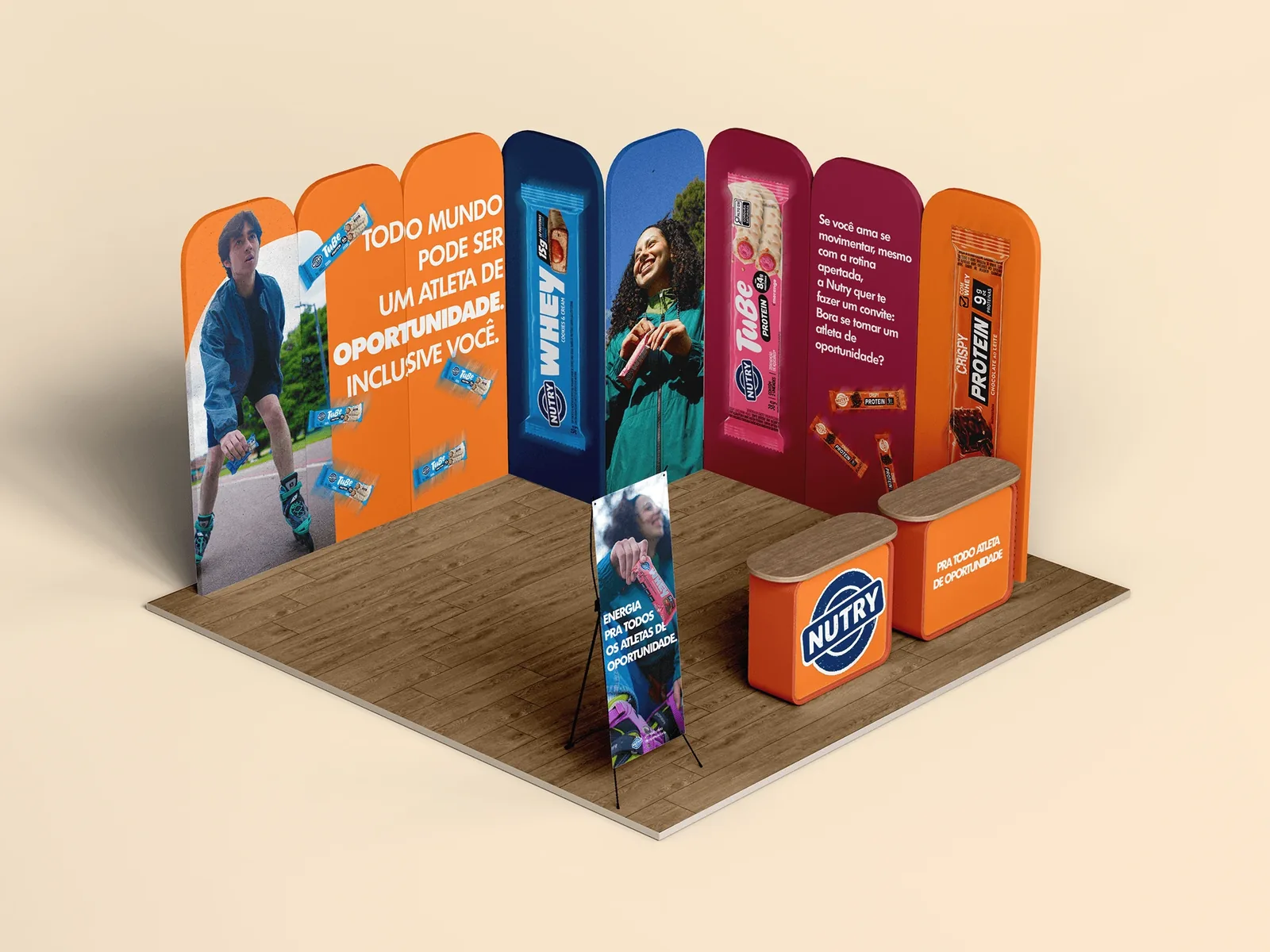
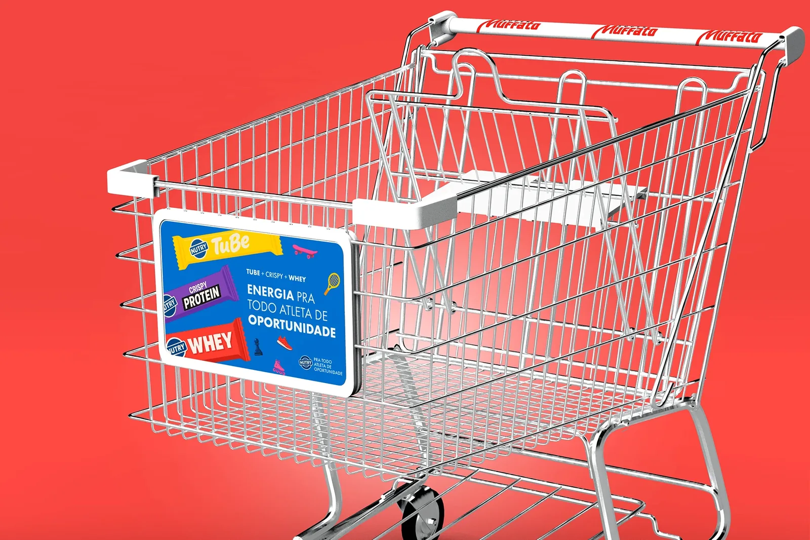
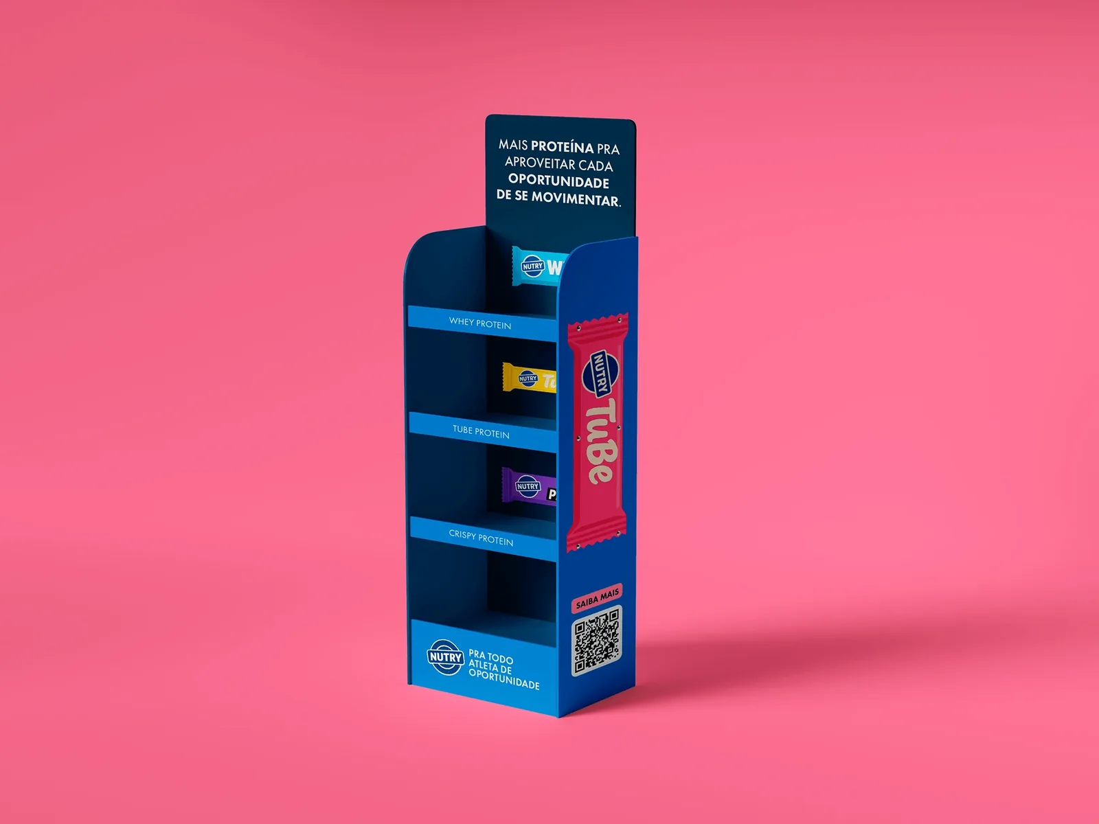
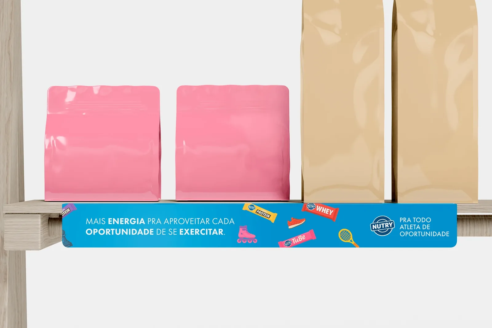
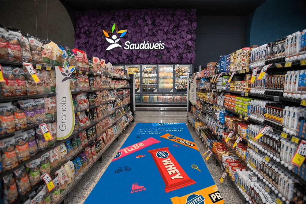
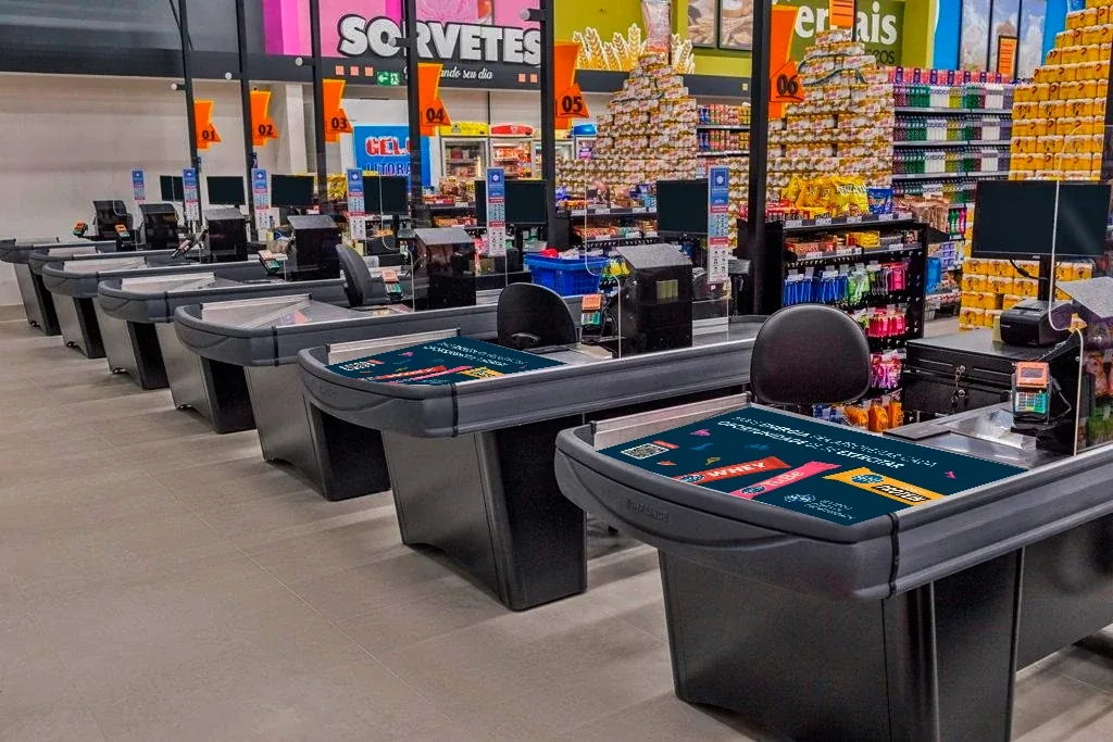
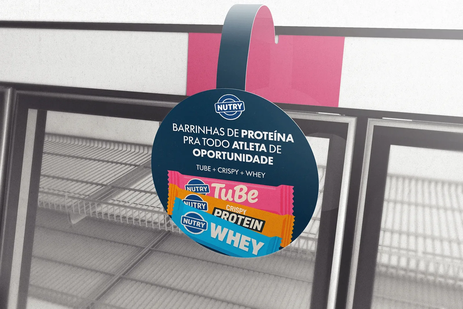
In the store, the campaign follows the shopper from the aisle to the checkout. The brand colors and the illustrated bars turn a cart panel, a floor display, a shelf strip, a floor sticker, a checkout mat and a wobbler into moments to stop and choose. An event booth carries the same system outside the supermarket.
Beyond the shelf
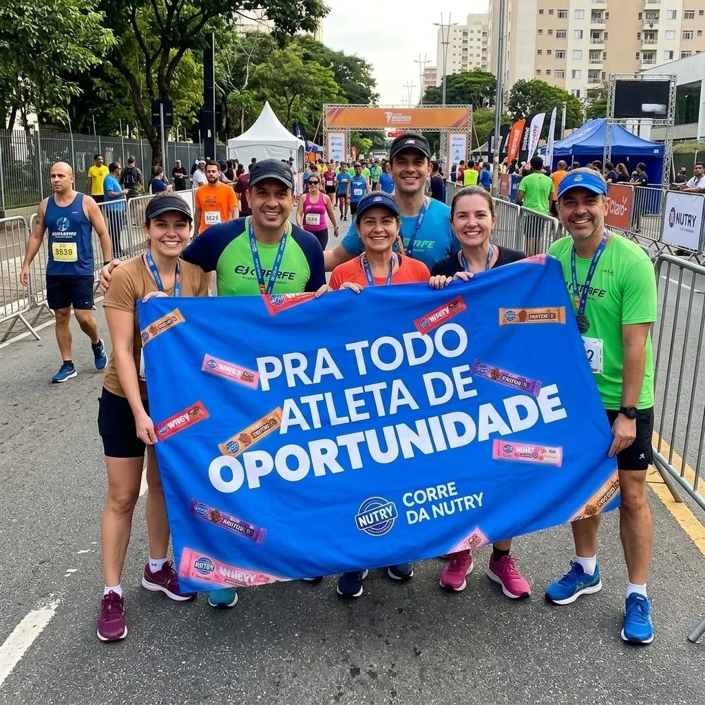
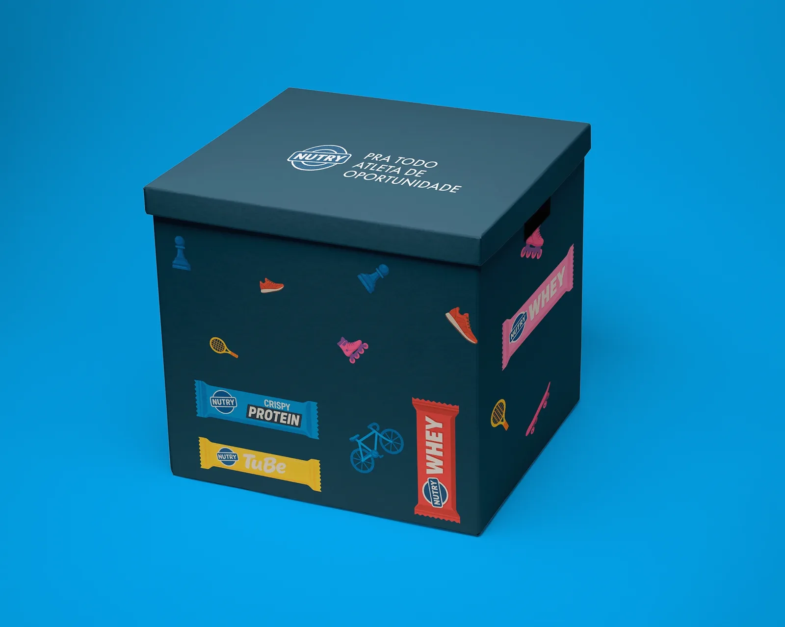
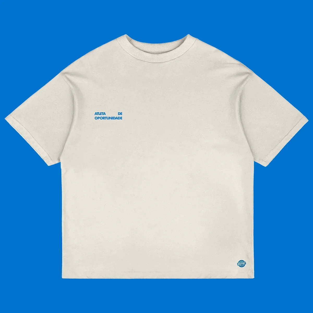
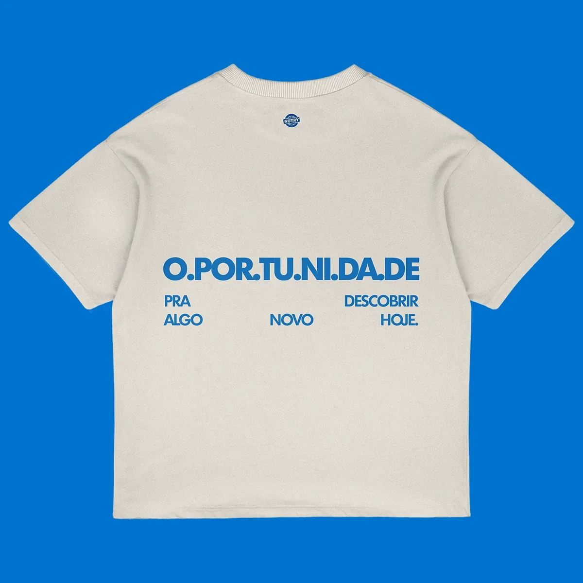
Outside the shelf, “opportunity athlete” becomes something people wear and carry: a group at a race behind the “Corre da Nutry” banner, a gift box, T-shirts that play with the word “oportunidade”. The slogan stays short and the illustrated icons do the talking.
LET'S TALK
Hiring, collaborating or have a project in mind? Tell me about it and let's see what we can make.